So, this is kind of interesting.
I noticed a story on Utne Reader about some great visualizations that a gentleman named Eric Fischer made, using demographic information from the 2000 Census to map out which ethnicities lived where, to demonstrate the kind of de facto segregation that still happens in cities in the US.
That, in turn, led me to the Radical Cartography site, which has a very similar visualization of the ethnic makeup of Chicago, made by Bill Rankin.
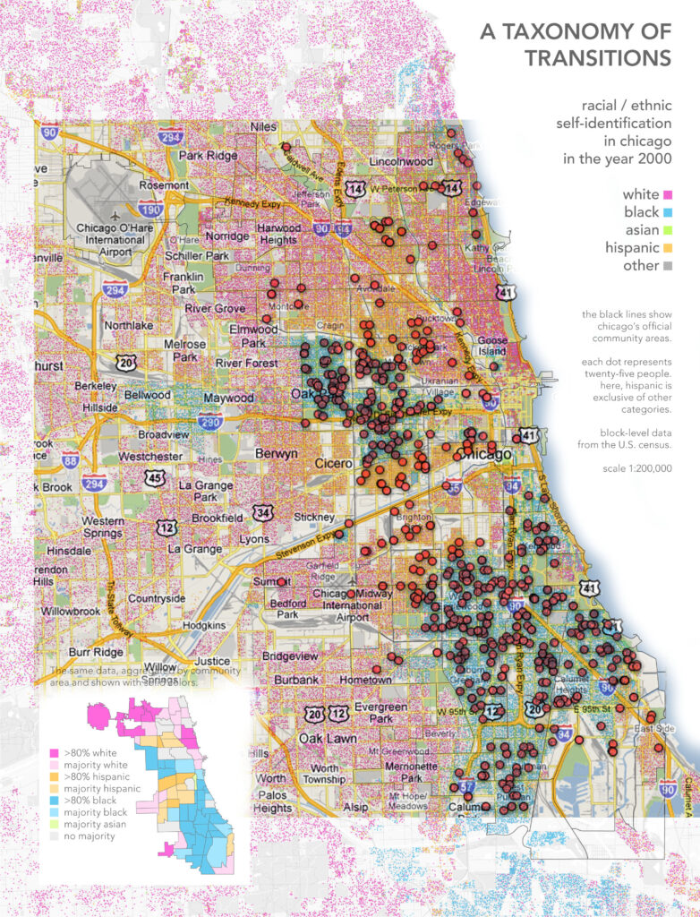
For fun, I hopped into Google Fusion Tables, and did a quick visualization of the RedEye homicide data from Chicago, 1/1/2009, to 3/4/2010.
In Photoshop, I dropped the demographic map on top of the homicide map. You can see the results below. Notably, most of the homicides have happened in primarily black and hispanic neighborhoods, while the extremely-white near north side has virtually none.
Click on the map for a full-size copy.
(Edit — it was data from the 2000 census, not 2010)

